bauhaus
client: Bauhaus Dessau foundation
location: Dessau
realization: 2015 (competition design)
program: exhibition and museum
The design principles of the museum are based on the design language and the ideas of the Bauhaus movement of the last century. Important to us is the simplicity and readability of the floorplan, structure and functions. At the same time we wanted to create a multitude of spatial experiences and a richness of intense colors.
one element on an orthogonal grid with columns
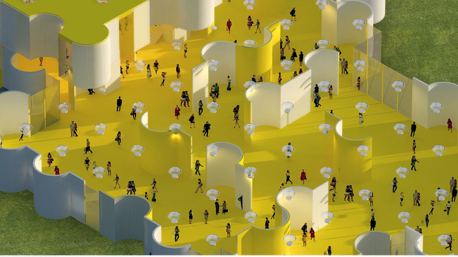
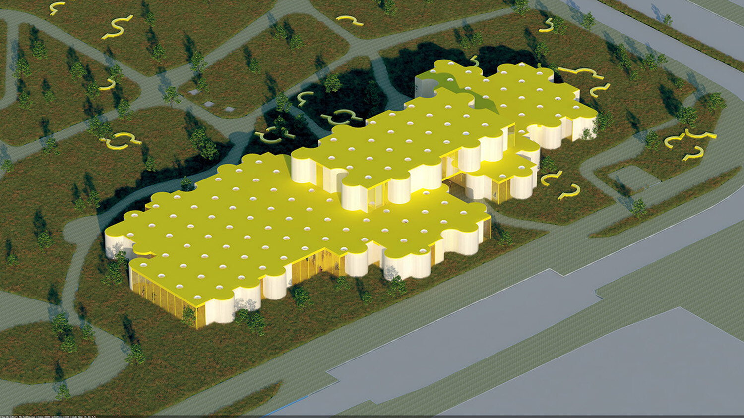
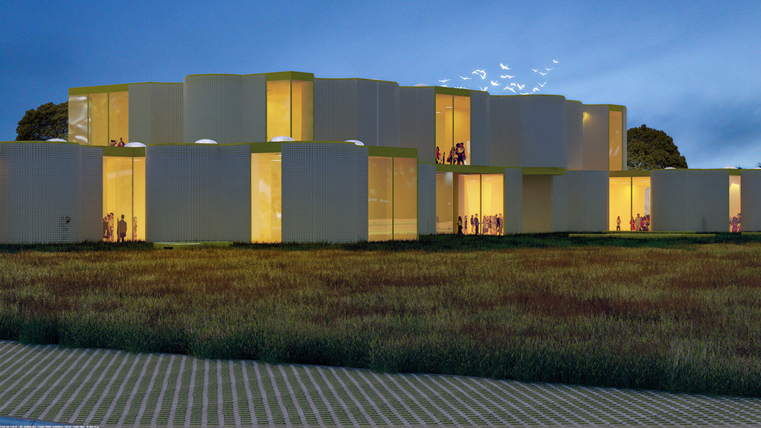
Through one element, which united several functions in it, the spaces in the museum are divided and the building is constructed. The element is thus at the same time; construction, interior partition wall, and movable element. The element is composed of a steel structure with a perforated outer skin. The inner side has a flat steel plate finish. In the surrounding of the museum the element is 50 cm high and acts as a bench to sit on. The element in the landscape is made of concrete.
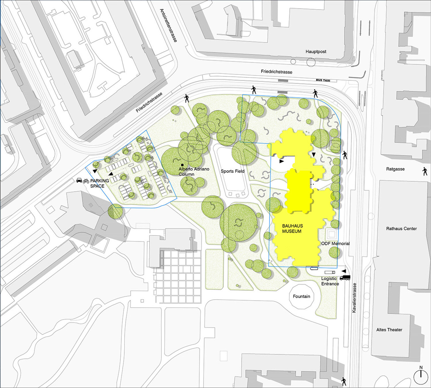
urbanism, passage
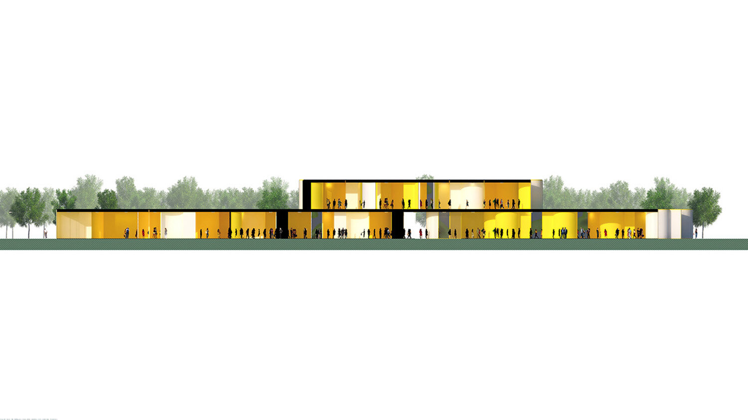
The museum is divided on the ground floor by a passage. This passage relates to the street plan of the area. At the end of the passage, seen from the street, there is a panoramic view over the park. In the passage itself the main public areas of the museum are brought together and are visible to the public. The entrances for the exhibition space are not in the passage. They are in the foyer and reachable from the 1st floor. The visitors will first go to the first floor, then they can go down to a permanent exhibition which is seen from the passage.
We understand that this is radical but find the advantages of the passage for the overall urban plan bigger. The shop and the cafe can independently of the museum be open and closed and the park will remain more accessible to walkers. If this is not desirable for the routing in the museum, the two parts of the building can still be put together; this is possible in this plan.
architecture
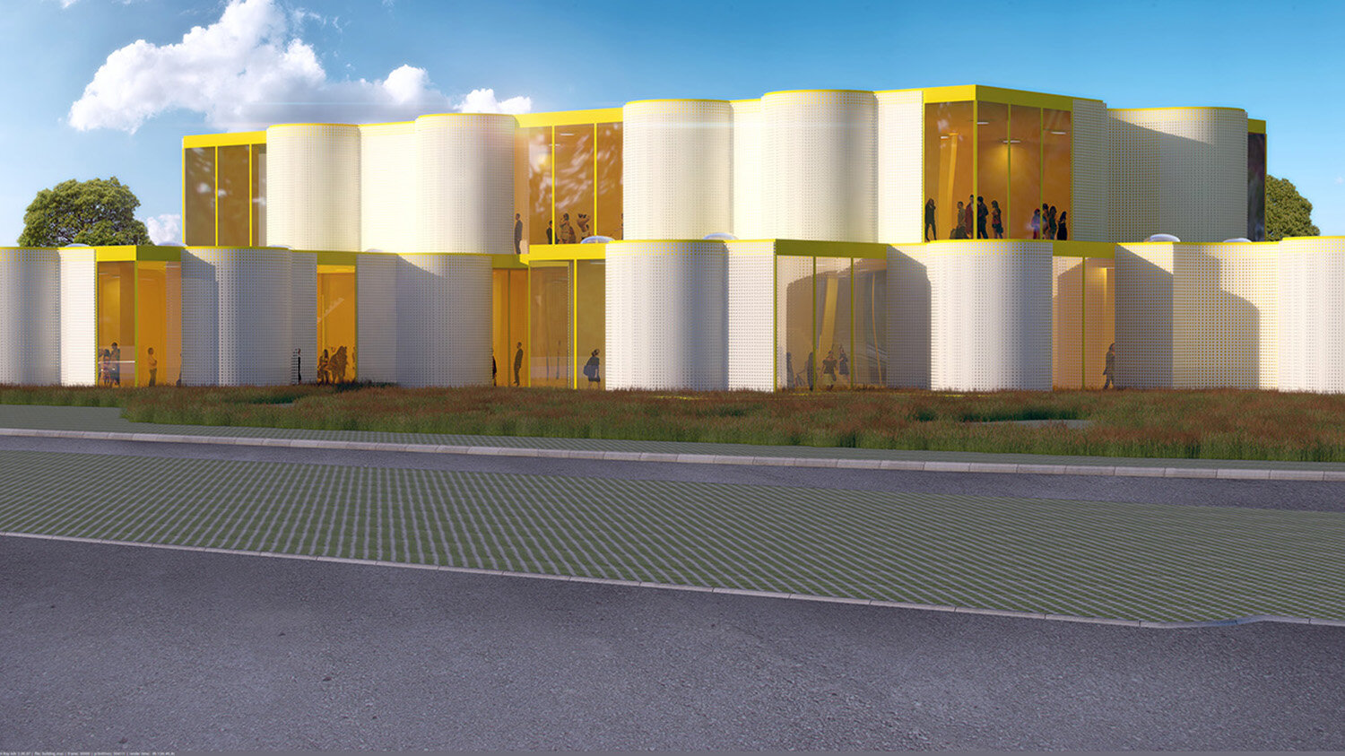
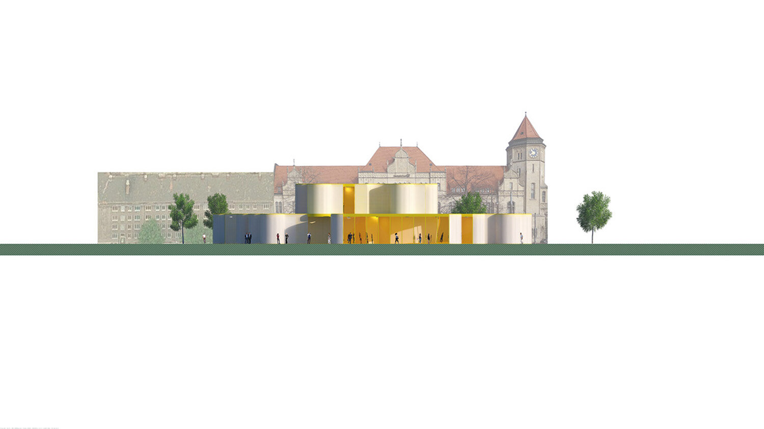
The yellow color of the interior is clearly visible and was a conscious decision. The white facade filters and neutralizes the intense color somewhat. The facade continuously has another appearance as a result of both the patterns created by the perforated steel walls, the reflection of the inside color on the facade and on the other hand, the variety of curved surfaces. Together this makes the appearance of the museum on all sides unique. The varying of the elements on the tight rhythm of the grid with columns creates an overview next to unexpected and unique spaces. It makes a personal interpretation of the works on display in the museum possible. Because the building is on all sides different, it has different views on the park and city, therefore it is possible to judge the artworks in the context of the city of Dessau.
