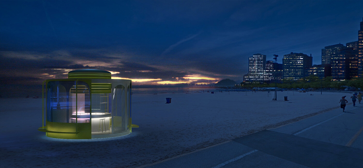
kiosk chicago
client:: Chicago architecture biennial
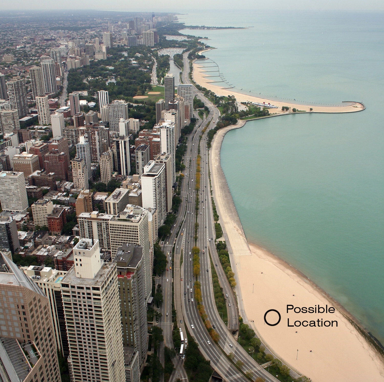
location: Chicago
realisation: 2015 (design competition)
program: lakefront kiosk
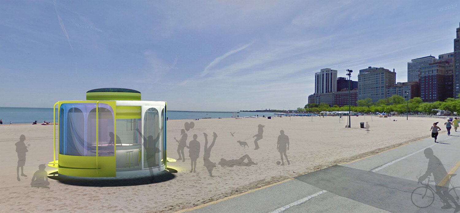
Imagine, you go for a cup of coffee on the lakefront of Chicago. You see the kiosk which has spectacular colors and you get curious. You arrive at the kiosk, you open the wall and enter. Quietly you sit down at the bar and order a cup of coffee. The sun begins to climb and gradually the sun’s rays come softly into the kiosk. It gives a serene and intimate feeling.
The bartender puts the stuff together for a busy day. Outside the first beach lovers begin to nest their selves in the sand and sportsmen and woman are working out. More and more people come to the kiosk, walls are opening and closing.
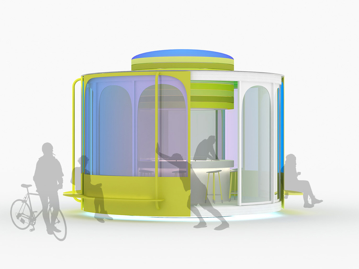
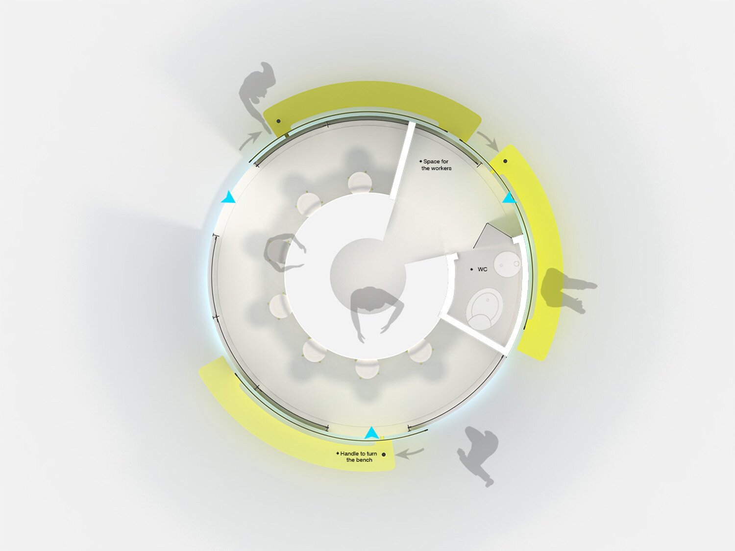
By finding an interaction between visitors and the pavilion, there is a social place off the coast of Chicago. A pavilion where people not only quick something to eat or drink, but a pavilion where people can meet and play also. Because the outer seating areas of the pavilion can run all the visitors will be brought into contact with a new environments. Spontaneously create new contacts and people will learn from each other. This interaction between the visitor and the pavilion is enhanced by the color effects that arise. This is because the visitor the color effect in and around the pavilion itself can determine by turning the outer facade. It will be a game where people consult to get the desired position / color effect. Visitors are seduced in this way to interact during their purchase with the possibilities offered by the pavilion. In this playful arises during the visit a solidarity between the visitors and residents of Chicago.
